一般來說如果網頁要使用文字的修飾線條,都會用到 CSS 的「text-decoration」屬性,不過這個傳統的屬性並沒辦法做太多動態的變化,因此這次教大家使用另一個 CSS 屬性「background-image」實際製作動態下橫線(底線),首先看看效果:
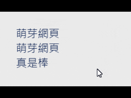
基本上就是網頁連結 <a>,游標移上去後觸發 :hover 進而顯現出動態下橫線(底線)。
首先,HTML 如下:
<a href="#">萌芽網頁</a>
<br>
<a href="#">萌芽網頁<br>真是棒</a>
接著是 CSS:
a {
  color: #00174d;
  font-size: 19px;
  text-decoration: none;
  background-image: linear-gradient(#00174d, #00174d);
  background-position: left bottom;
  background-size: 0 2.5px;
  background-repeat: no-repeat;
  transition: background-size 0.15s linear;
}

a:hover {
  background-size: 100% 2.5px;
}
既然使用了「background-image」,「text-decoration」也就不需要了!記得一開始就將其設為 none,接著運用漸層背景置底,運用寬度變化來製作動態效果,參數都可以調整,目前動畫速度設定成 0.15 秒。
附上 CodePen:
See the Pen
動態下橫線(底線) - CSS - 萌芽の網頁設計實驗室 by Feng, Cheng-Chi (@qwe987299)
on CodePen.
贊助廣告 ‧ Sponsor advertisements


 《上一篇》Google Chrome & Microsoft Edge:開啟右鍵選單功能「建立分享 URL 用的 QR Code」
 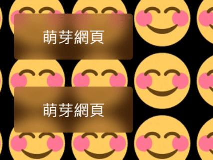 《下一篇》CSS backdrop-filter 原生背景毛玻璃


留言區 / Comments
萌芽論壇